creative strategist

Banner_WWAGDD.gif

WWAGDD?

A series of blog posts aimed at helping those many marketers and small business owners I’ve known through the years who find themselves exasperated by a project that verges into design territory.

Of course, the best solution is to call me up so we can figure it out together (of course!), but I know sometimes budgets just don’t allow for it. So, find on these pages tips and tricks from presentation flow to custom colors to typography tips and beyond.

Bigger isn’t always better (esp. in PPT land)
 

I don’t know about you, but in my world, everyone’s still working from home, and I keep hearing “this PPT file is SO big, I can’t get it to send” or “UGH, I’m going to have to break this file down into chunks to be able to email it—even using WeTransfer”.

One of the perks of working at an office is lighting fast internet that we can just take for granted.. at home? not so much. If you’re running into this problem, like so many of my clients, there’s a really effective fix—compress pictures.


I recently compressed a file using the “email” setting and didn’t lose any quality worth mentioning.. AND the file went from 300mb to 50mb. A total game-changer for my client.

This little trick is a good one to have handy while we are all still figuring out how to collaborate across the miles.

Keep wearin’ those masks!
Amy
PPTfilesize1.jpg
PPTfilesize2.jpg
 
Amy JacksonComment
Did I just hear you double space?
2020_1_doubleSpaced.png
 

In these crazy, coronavirus times you’ve hopefully all joined me in working from home. How many of you are feeling some freedom now that you don’t have to walk by your favorite graphic designer on trip to the coffee maker? Maybe you think your Power Point is already perfect and there’s no need to bother them… or perhaps that sell sheet looks just fine in Word?

On the off-chance any of you are quietly nodding your heads, I thought I’d bring up the one thing I do with nearly all the copy that comes across my desk: I delete all of the extra spaces!

Oddly, this isn’t constrained to the spaces after a period, but also after bullets, or when you want to turn a line but not have a hard return (try shift+return), and really, they often turn up in places I’d never expect. It’s super easy to make this change (find/replace all “ “ with “ “), however! if you’re tempted to just-hit-send and you have a double spacing habit, your copy is going to be harder to read than necessary.

There are several theories as to the why of double spaces, I won’t go into them all. I’ll just say, we are on smart computers & phones using smart fonts and all that smartness means the space after a period has been designed into the characters of your font. So, let’s avoid using mono-spaced fonts (illustration on the top left) because: yuck. And try not adding in the extra space you can so easily see in the top center illustration. Let the font do the work for you and save that extra space!

Stay safe and sane and keep washing your hands,
Amy

 
Amy JacksonComment
Getting graphic for the holidays
 

Halloween is just days away and then bigger holiday greetings needs will follow fast. I’m here to help you get ahead of those holiday-themed eblasts (or facebook updates, sale announcements, etc). Below are a few links for jpg/ppt files to get you started. They are blank and ready for your message—so, download the files, open up ppt, pop in your copy, make them the size you need, and export the image!
Happy Holidays (already), Amy

 
Amy JacksonComment
Stock images are awful.. but they don't have to be!
 
iStock-Unfinished-Business-2.jpg

If every stock image could star Vince Vaughn and Dave Franco, then we’d be in business. Unfortunately, most don’t and are therefore, in large part, horrible.

And the thing is, unless you’re a glossy mag with thousands of custom photos at your disposal, you need these images to help the flow of your presentation, underscore the story you’re telling, and introduce a critical visual language. Most importantly, as we all know, a photo is worth a thousand words (at least!) which is the perfect way to cut down the total number of slides you use. 

Stock images don’t have to suck if you know where to look.

There is one site that I will whole-heartedly recommend: https://unsplash.com. The photos on this site are definitely still “stock,” but the majority have an authentic vibe that goes a long way in telling your story. Below is a facebook ad for the book The Last Thunk and a simple powerpoint divider slide—both make great use of unsplash images.

 
TheLastThunk_Ads_f1b-01.jpg
Ugam_Presentation_AJ-04.jpg
 

Other sites worth a glance:
https://gratisography.com/
https://www.shutterstock.com/
https://www.pexels.com
https://www.istockphoto.com/
https://www.lifeofpix.com

Good luck with your projects and just remember, slow down and take a deep breath, you’ve got this—and if that doesn’t work, give me a ring! -Amy


Custom Colors and Expanded Palettes
 

Let’s start by thinking about the bar graphs and pie charts you can create quick and easy in PowerPoint. Help them make an even bigger impact by using your brand colors instead of PowerPoint’s default hues. You most likely have one or two brand colors to work with, here’s your chance to get outside of the box a bit: consider also using a secondary palette of shades.

You can make this secondary palette yourself—tilt your brand color a little more red, a little more yellow, and you’ll start to develop a set of shades that will inject even more life into your brand’s assets.

 
4-01.jpg

Almost every program gives you the opportunity to select a color other than the shades they have pre-selected.

Colors.png


Apply this thinking to images as well.

Don’t go crazy looking for your exact brand color either. Choose a selection of images that includes lighter and darker shades of the same color. Not only will the images function as support and context for your main points—as they’re meant to do—but they’ll look cohesive and down right slick. And, let’s face it, visual appeal is attention grabbing!

 
4-02.jpg
 

Slow down and take a deep breath—you’ve got this.
But if it’s time to bring in a pro, give me a ring!
-Amy

 
Color: Small changes make a big impact


Did you know…

Stock illustrations don’t have to remain in their original tones?

It’s hard enough to find stock illustrations that convey your ideas, let alone one in your brand’s colors. You’ll make stock images look much more custom if you edit the colors to match your palette. Side note: if you find these tips aren’t working, it’s a sign from heaven—it’s time to update your programs.

 
Rakuten-03.jpg


Three steps and you’re in business:

ONE
File format matters: you MUST start with either an .eps or an .svg file which are native, layered illustration files that allow editing. This means you’ll want to conduct your image search in a stock photo site versus Google search. Yep, .jpg or .png won’t cut it. Next, in order for this to work in PowerPoint or Word, you must use an .svg. To convert an .eps file to an .svg file, simply head over too https://cloudconvert.com/

TWO
Insert the .svg file into Powerpoint or Word (Insert > Picture(s) > Picture from File)

CloudConvert.jpg
 

THREE: PowerPoint
A.
Once inserted, double click the image OR choose “Graphic Format”

B. Choose “Convert to Shape”

GraphicFormat.jpg
ConvertToShape.jpg

C. Choose “Yes” when the alert comes up

D. Ungroup the elements of the illustration: Arrange > Ungroup

Alert.jpg

THREE: Word
A:
Right click (Control + click) on the image, choose “Convert to Shape” and say “yes” to the alert

B: Right click (Control + click) and choose “Group > Ungroup”

That’s it! Each piece of the illustration is now free to change colors
**This works best when the illustration is created with basic, solid colors—when there are a lot of gradients, the conversion isn’t as clean**

Slow down and take a deep breath—you’ve got this.
But if that doesn’t work, get in touch!
-Amy

 
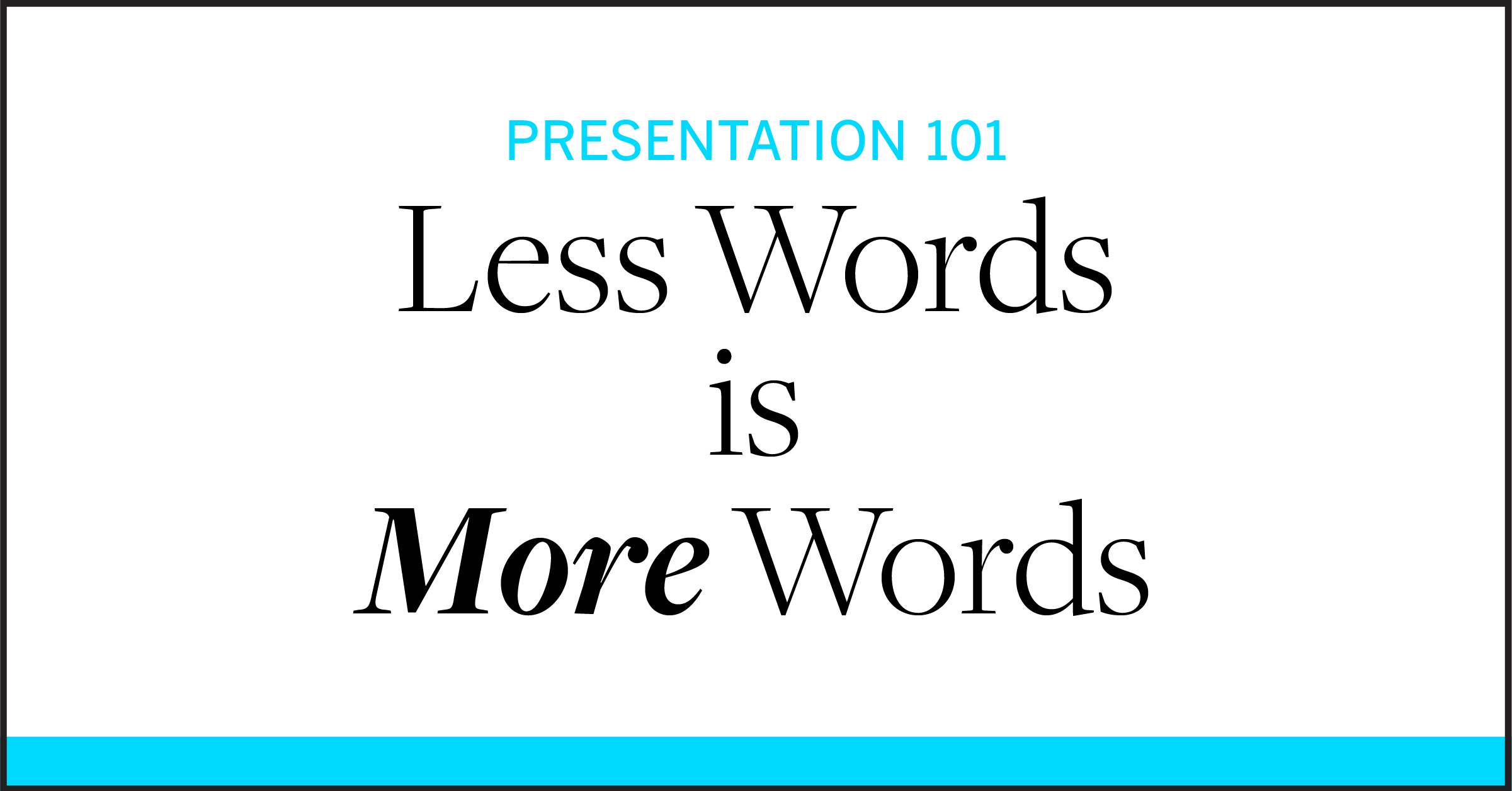
Presentation 101: Less Words is More Words
 

I think deep down, most people know that using slides to write out full, complete thoughts is a big no-no, but I still see these type of slides in action anyway. The most common reason I get is, “it’s all too important to cut anything out!” This may be true, in fact, hopefully everything you plan to say is very important, BUT it still isn’t an excuse to treat the slide like your script. There’s a better way...

lessismore.gif

Less Words is More Words
Think of it like this: The slide and what you’re saying aloud are two separate things that should work in tandem. No one needs to both read along (because you can bet your audience will be reading whatever’s on your slide) AND listen to the same thing word-for-word. That’s your slide working against you. Instead, the slide should visually aid, underline, highlight your main point(s). One supports the other and, without both, you’d only be looking at half of a presentation.


com.gif

But More Slides is Sometimes the Answer
I know, there’s always SO much to get through when you’re up there with your audience’s attention. So what do you do when you inevitably find yourself with too many points and not enough slide?  Add a slide. It’s totally OK! A common worry is that a large number of slides means you’ve made a long presentation—but that math only works if you stay on them for an extended length of time. If you’re snapping through them as you make your points, the number of slides won’t have an effect on the time you’re speaking, but will have a very positive effect on the engagement of our audience.

That’s it for this week! Slow down and take a deep breath—YOU’VE GOT THIS.
But if that’s just not happening, give me a ring!
-Amy

 
Amy JacksonComment
Presentation 101: Here’s how to NOT overwhelm (bore) your audience
 

In a dream scenario, your presentation would WOW them all, standing ovation... but let’s start with the basics to keep your audience engaged! Over the next few weeks, I’ll be posting some simple presentation design tips (just look for “Presentation 101”) that will help you grab—and keep!—your audience’s attention and ensure they leave with the message you intend to communicate. Let’s be real, this alone is a feat in a world where literally everything is designed to focus your attention elsewhere. Is that the new-text-vibrate or the Instagram-DM-vibrate you just felt?

In this first installment of Presentation 101, let’s talk about grouping information and setting clear communication expectations with your audience. While the topic of your presentation may make you totally light up inside—you could talk about this all day!—it’s helpful to give your audience a few hints that (1) you definitely are prepared and following a script and (2) you are going to let them know where you are in the flow of the presentation so they can focus on what you’re saying instead of wondering how much longer they have to listen.

Here are a few ways to get you there:

1. Setting expectations for the cadence of your presentation can be verbal or visual. With a short presentation there’s no need to add slides just to categorize your already streamlined ideas, just communicate the main points you’ll cover and then dive in.

2. To keep things organized and flowing, break your presentation into groups. Use note cards or outlines to make sure your topics work together and you are taking the audience on a clear journey to the conclusion.

3. Once the topic groups are identified, label them. Work to make the labels consistent in length and terminology. These topic slides become a visual key the viewer can use to follow along in your talk. The key can be visualized in several ways, and can be a great place to introduce imagery.

 
SEPT13.jpg
SEPT14.jpg
SEPT18.jpg
NeighborNetwork2a.jpg
ChicagoNeighborNetwork11.jpg
ChicagoNeighborNetwork14.jpg
 

4. Don’t be afraid to break the larger points into sub-sections—just make sure to communicate this with the audience so they can follow along.

 
Sept2011-9.jpg
Sept2011-11.jpg
Sept2011-22.jpg

That’s it for this week! Slow down and take a deep breath—YOU’VE GOT THIS.
But if that doesn’t work, you know who to call!
-Amy

Amy JacksonComment
Introducing: wwagdd?
 
blockprintamy.gif

It’s official, I’m launching my own design consulting business!

To kick it off, I’m putting together a series of blog posts aimed at helping those many marketers and small business owners I’ve known through the years who’ve found themselves exasperated by a project on their plate that verges into design territory.

Of course, the best solution is to call me up so we can figure it out together (of course!), but I know sometimes budgets just don’t allow for it. So, in the next weeks be on the lookout for tips and tricks from presentation flow to custom colors to typography tips and beyond.

Cheers, Amy

 
Amy Jackson Comment